12. Understanding CV Metrics and Graphs#
12.1. Overview#
In this section, we will look into interpreting key metrics and graphs essential for evaluating computer vision models. Metrics like precision, recall, F1 score, and mAP give insights into model performance, while graphs provide a visual representation of the model’s learning process. The graphs analyzed were produced from localizing a large object detection model (MBARIs Fathomnet) on imagery captured at a methane seep via a digital still camera. To learn more about this model check out its modelcard here: https://huggingface.co/spaces/FathomNet/RCA_Digital_Still_Cameras
12.1.1. Learning Objectives#
By the end of this section, you will:
Understand key evaluation metrics.
Interpret performance graphs effectively.
Recognize and diagnose overfitting and underfitting.
Use metrics and graphs to improve model performance.
12.2. Key Metrics and How They Are Calculated#
12.2.1. 1. Accuracy#
Accuracy measures the percentage of correct predictions out of the total predictions made by the model.
12.2.1.1. Formula:#
While accuracy is a good metric when classes are balanced, it can be misleading in cases where the dataset is imbalanced.
12.2.2. 2. Precision#
Precision measures how many of the predicted positive instances are actually correct.
12.2.2.1. Formula:#
Precision is crucial in scenarios where false positives are costly.
12.2.3. 3. Recall#
Recall measures how many of the actual positive instances were correctly identified by the model.
12.2.3.1. Formula:#
Recall is essential if it’s important not to miss any instances of a particular class.
12.2.4. 4. F1 Score#
The F1 Score is the harmonic mean of precision and recall. It balances the trade-off between the two metrics. It ranges from 0 to 1, with 1 being the best possible score. The harmonic mean is used to give equal weight to low values. Because of this, if either precision or recall is low, the F1 score will also be low, even if the other value is high. This means that if a model has high precision but low recall, it will have a low F1 score because it is not correctly identifying all of the positive instances.
12.2.4.1. Formula:#
12.2.5. 5. Mean Average Precision (mAP)#
In object detection tasks, the mean Average Precision (mAP) evaluates how well the model predicts bounding boxes for multiple classes.
12.2.5.1. Formula:#
mAP is calculated by averaging the Average Precision (AP) across all classes.
12.3. Key Metrics and Their Graphs#
12.3.1. F1- Confidence Curve#
The F1 Curve shows how the F1 score changes across different thresholds.
X-axis: Confidence (e.g., 0 to 1).
Y-axis: Corresponding F1 score.
12.3.1.1. Interpretation:#
A peak in the F1 curve indicates the optimal balance between precision and recall.
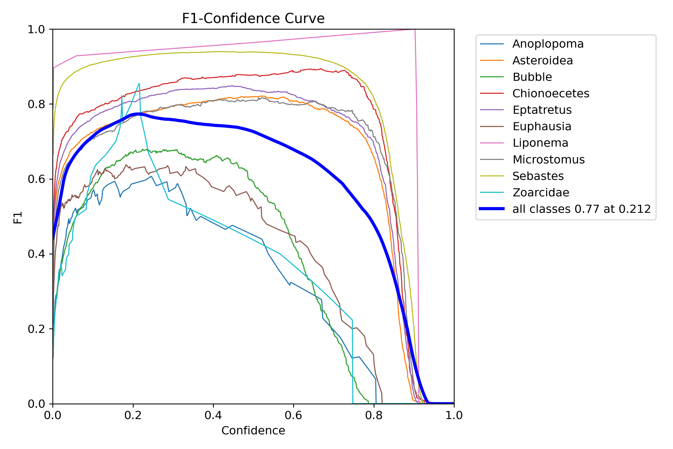
Fig. 12.1 Bigham & Carter 2025#
In this figure the model is reporting a ratio of 0.77 F1 at 0.22 confidence. In general a well fitting model will show similar results to well represented classes like the Sebastes, Asteroidea and Chionoecetes. Conversely, classes like Zoarcidae, Euphausia and Bubble are not displaying the nice rounded parabola with a middle plateu at a high F1 value for a wide range of confidences.
12.3.2. Precision-Recall (PR) Curve#
The PR Curve plots precision against recall for different thresholds.
X-axis: Recall.
Y-axis: Precision.
12.3.2.1. Interpretation:#
A higher integrated area under the PR curve (AUC) indicates better performance.
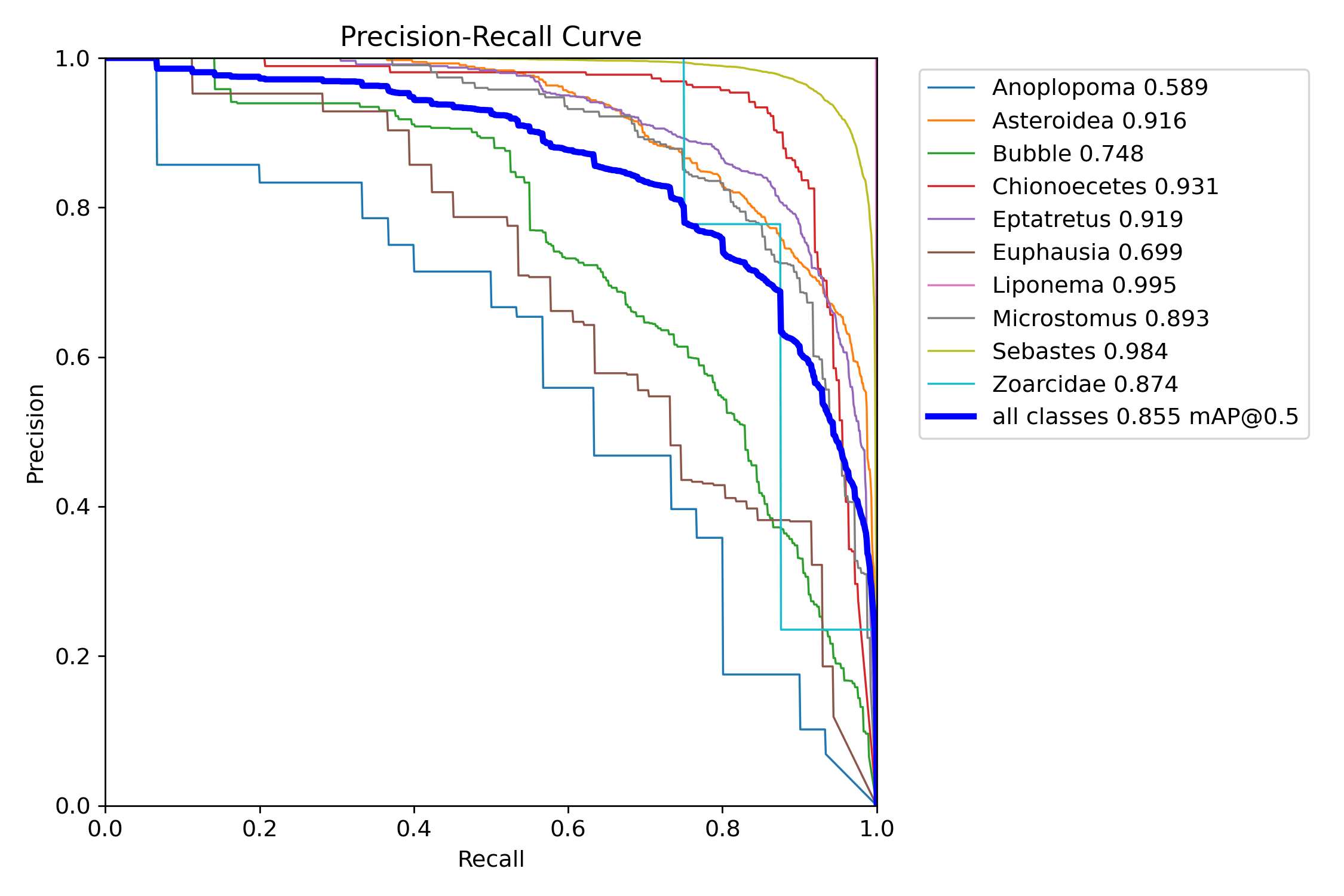
Fig. 12.2 Bigham & Carter 2025#
This figure shows the aforementioned classes that are performing well have a greater AUC then underrepresented classes.
12.3.3. Recall-Confidence (R) Curve#
The Recall Curve shows how recall changes with different thresholds.
X-axis: Confidence (e.g., 0 to 1).
Y-axis: Recall values.
12.3.3.1. Interpretation:#
High recall at low thresholds indicates the model captures most positive instances.
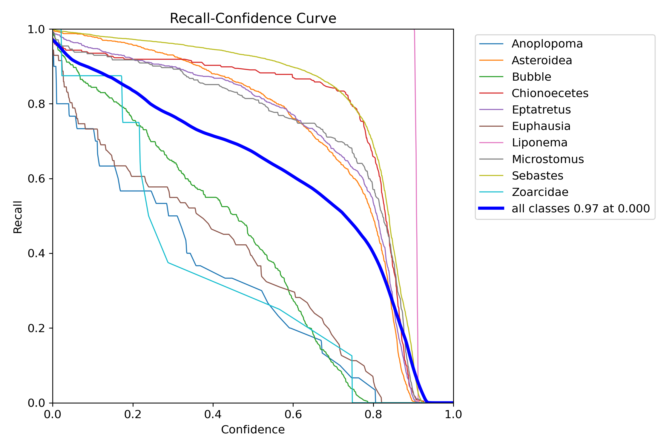
Fig. 12.3 Bigham & Carter 2025#
Similar to the PR curve, a higher AUC generally indicates higher performance. Uniquely, this type of graph allows you to analyze your models predictive accuracy on edge cases. This is because you are able to assess performance of correct IDs even if the confidence is low. For classes detected on the edge of the camera lense that is subject to chromatic aberation and being partially blocked. Looking at the recall rate at low confidence can be a good indicator of detection performance and model health.
12.3.4. Precision Curve#
The Precision Curve depicts precision as a function of the confidence threshold.
X-axis: Confidence threshold.
Y-axis: Precision.
12.3.4.1. Interpretation:#
A sharp drop in precision at higher thresholds indicates overconfidence in predictions.
How to Use: Adjust the threshold to balance precision and recall.
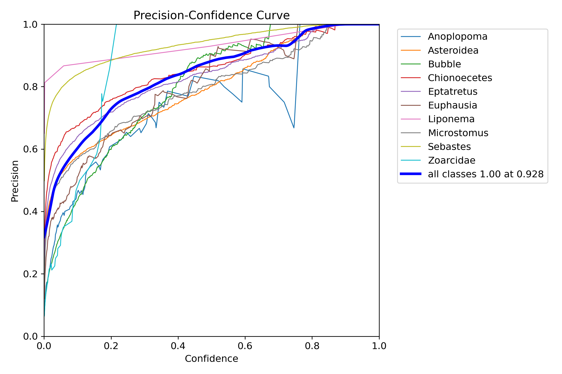
Fig. 12.4 Bigham & Carter 2025#
In this figure the model is reporting an increase in precision as confidence increases. Noticably the Anoplopoma shows a sharp drop in precision at the higher confidence threshold, this sharp drop is indicative of overfitting where a model too confidentally learns features in the training set that are not representative of a class in real world data. This can be remedied by rebalance of the Train/Val splits and ensuring enough representative classes in the dataset.
12.3.5. Confusion Matrices#
12.3.5.1. Standard Confusion Matrix#
Values are counts which can be useful for detecting class imbalance.
Rows: True labels.
Columns: Predicted labels.
12.3.5.2. Normalized Confusion Matrix#
Values are normalized to show percentages rather than counts. Oftentimes this figure will be the one reported as it gives per class values that are not affected by class imbalance.
Rows: True labels.
Columns: Predicted labels.
12.3.5.3. Interpretation:#
High diagonal values indicate accurate predictions.
Off-diagonal values highlight misclassifications.
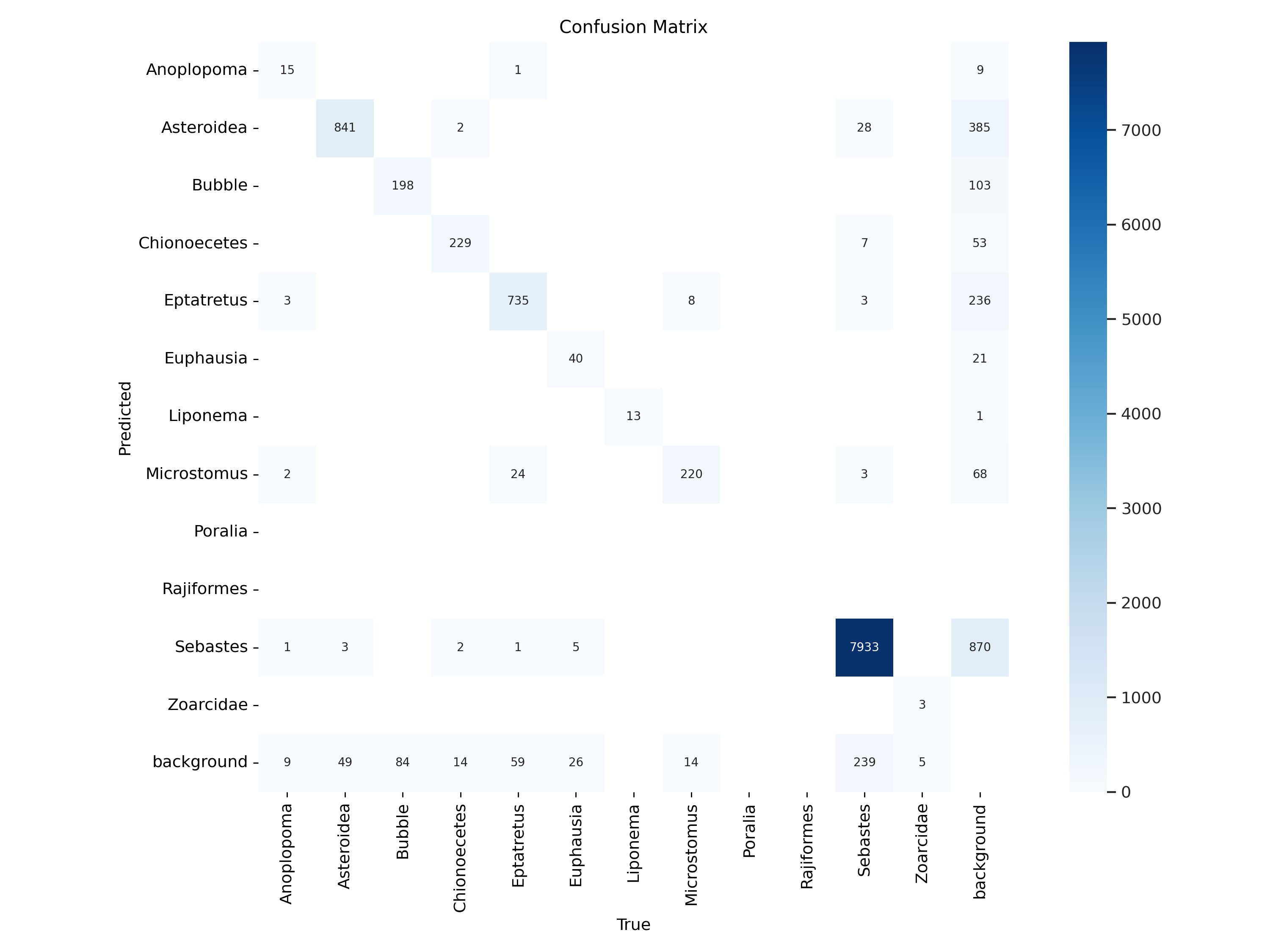
Fig. 12.5 Bigham & Carter 2025#
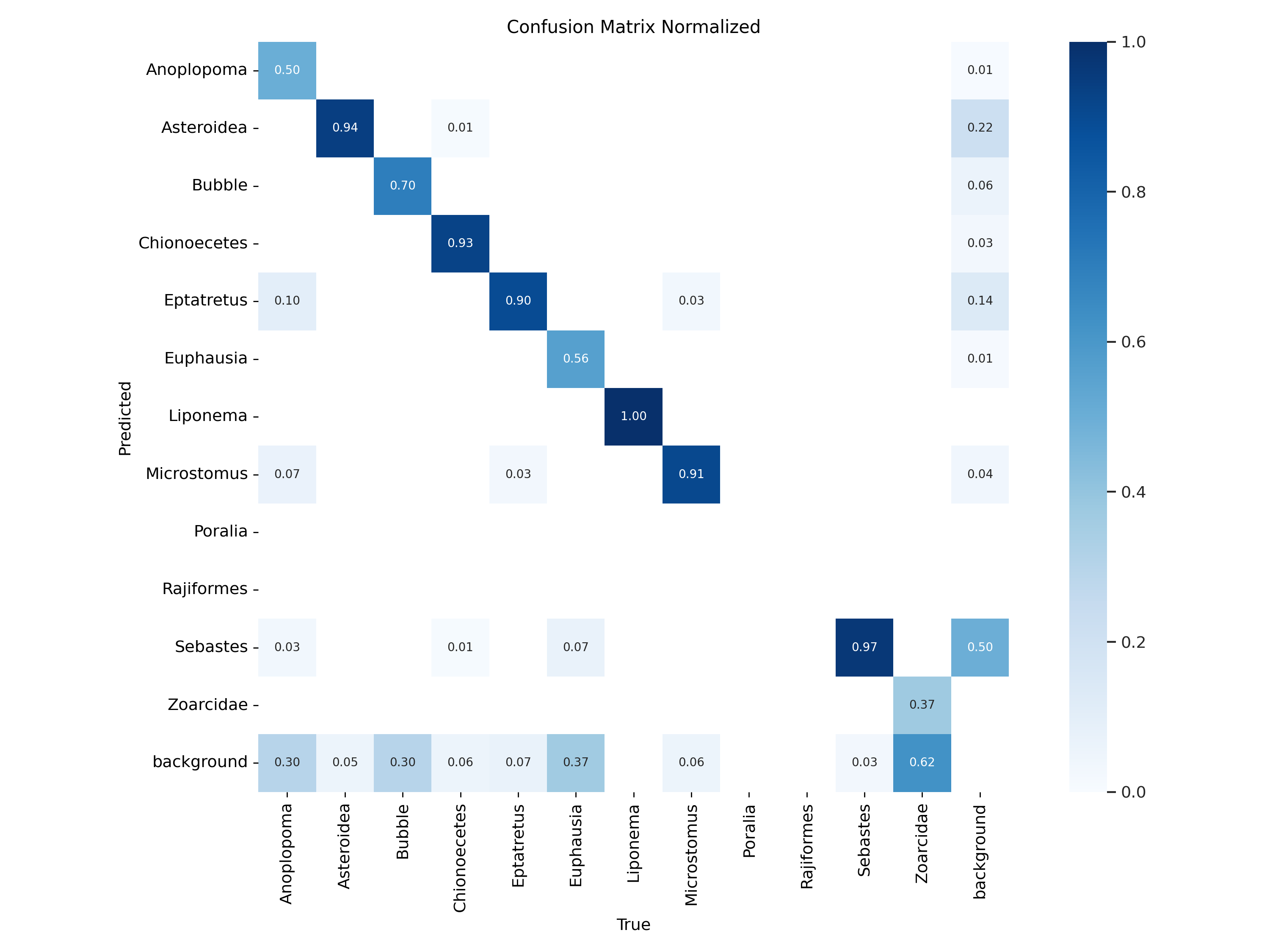
Fig. 12.6 Bigham & Carter 2025#
In this figure the model is reporting relatively high performance for most classes. In an ideal world, a perfect model would predict the true label 100 percent of the time, this would lead to the graph showing a perfect diagonal line with no hits for the other classes. When working with real world data this is never the case. In this specific example we can note a couple of things. First it is important to see that class imbalance can change the way these metrics are reported. One example of this is the difference between the Liponema and Sebastes class. Both classes show high Predicted/True values looking at the normalized matrix. However when looking at the raw counts we can see that the 97% reported by Sebastes shows 7933 true labels and around 300 missidentification (or entire misses in the case of “background” detections). Contrarily although Liponema is reporting a 100% Predict/True, that rate is based only on 13 correct IDs.
12.4. Putting It All Together#
Interpreting these graphs helps diagnose issues like:
Overfitting: High training accuracy with low validation accuracy.
Underfitting: Both training and validation accuracy remain low.


